Welcome to our website!

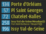
Clever design maximises impact of Parisian LED signs
Source : This web site
Published : 2013/3/9
Clever design maximises impact of Parisian LED signs
Paris is a beautiful city, with the process of actually getting around to see the sights made all the easier, thanks to its efficient and affordable public transport networks.
But whether you are a visitor or a local, in the past it was relatively difficult to work out whether you were heading in the right direction on the right bus, as a result of something incredibly simple; the font used on the LED signs found on public transport.
To address this, designer Jean Francois Porchez was commissioned to reassess the work he did 15 years ago and come up with a new standardised font, that maximises the effectiveness of LED displays, allowing them to convey much more information without requiring an entire overhaul of the hardware itself.
This was not an easy task and was specifically intended to fit in with pre-existing fonts, while being better suited to use on LED signs, which in the case of Parisian buses, were deliberately low resolution to provide big, bold and easy to read text for passengers.
A lot of the destination names had to be abbreviated in the past because of their length, but Porchez devised such a suitable font, that it has been made possible to get around this and still make the text highly legible.
Porchez said that his team decided to opt for static text of a smaller size, rather than relying on larger text that would scroll to showcase the entire string of content. This was necessary because it is harder to read larger, scrolling text, than smaller, static text, when the bus is in motion.
So the next time you are in Paris, it is likely that you will encounter the new and improved use of LED signs on public transport, all thanks to a simple, yet carefully considered, change in font.
 English

 »
» 

